| front |1 |2 |3 |4 |5 |6 |7 |8 |9 |10 |11 |12 |13 |14 |15 |16 |17 |18 |19 |20 |21 |22 |23 |24 |25 |review |
 |
Using visuals and
clip art in PowerPoint can be very tempting. There are two questions that should be
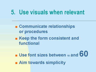
addressed if you decide to use a picture or graphic. How does it help the learner understand the material in a way that is clearer than text alone? Relevance, detail and clarity can affect the perception and comprehension of graphic information. If a student cannot easily read or see something, or does not understand its relationship to the other information presented, then the graphic risks becoming a distraction. What effect, if any, does the visual have on downloading and printing? In this regard, you may want to check with the webmaster for advice in preparing your image in a way that is compact and ensures accessibility. One effective use of graphics demonstrates relationships such as those between concepts, or those between steps in a procedure. Well designed visuals can also have a motivational effect on the learner. Graphics and images involve different processing by the brain, providing variety and relief to a presentation that is strictly textual. Another good design feature maintains a consistent form throughout your slides. Use a similar style throughout your outlines, so that readers do not have to re-orient themselves each time they come to a new heading. An effective visual presentation is easy on the eyes, aiming toward a simplicity that facilitates reading and comprehension. |
| front |1 |2 |3 |4 |5 |6 |7 |8 |9 |10 |11 |12 |13 |14 |15 |16 |17 |18 |19 |20 |21 |22 |23 |24 |25 |review |