| front |1 |2 |3 |4 |5 |6 |7 |8 |9 |10 |11 |12 |13 |14 |15 |16 |17 |18 |19 |20 |21 |22 |23 |24 | 25|26 |27 |28 |29 |30 |31 |32 |33 |34 |35 |36 |37 |38 |39 |40 |41 |42 |43 |44 |45 |46 |47 |48 |49 |50 |51 |52 |53 |54 |55|56 |57 |review |
 |
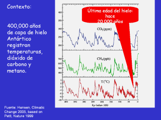
The data comes from a 1999 article in Nature
which discussed Antarctic ice cores. Bottom scale shows 10,000 years per tick, with 1850 at the far right where it says 0. The far left is -420,000 years. Bottom red line is temperature in celsuis, about 1 degree C = 2 degrees Farenheit. Note how in Antarctic temperature has varied cyclically from About -10 C to about +2 C. Also note the red temperature band at about 0-2 C, above 1850. This is the last 10,000 years, all of known civilization right here. This is the Climate our society has known. It is a tiny range relative to the past. Also note how fast we come out of the depths of the ice ages. It happens very, very quickly, and the cause of this is under active investigation. This is ‘abrupt climate change’. It appears that glaciers take tens of thousands of years. To generate, yet melt very quickly. This may have important ramifications for the ice on the planet now, and the potential for large sea level rise. Green line in middle graph is methane, a very potent greenhouse gas (about 20x as powerful at Carbon Dioxide). Note how it varies from about 400 parts per Billion to about 700 parts per billion (ppb) over the last 420,000 years. Blue line in top graph is carbon dioxide. Note how it varies from about 180 parts per million to about 280 parts per million (ppm) over the last 420,000 years. Here’s what the animated lines show: (you’ll need to start a slide show to see this) Animation 1 The orange bars on the Temperature graph show the 100,000-year long slides into past ice ages. The ice ages are brought on by subtle changes in the Earth’s orbital parameters – the roundness of our orbit around the sun (eccentricity), the tilt of the earth’s axis (inclination) and Something called precession – how close the poles are to the sun during winter and summer. Believe it or not, these changes can bring on ice ages, and periods of warmth. Animation 2 and 3 2) The solid black lines show how the methane and carbon dioxide concentrations are timed exquisitely with the temperature changes. This is because as the Earth warms the oceans give off carbon dioxide (imagine heating a can of Coke on the stove), and because as it warms biological activity generates more methane. As this happens both Co2 and CH4 provide additional warming (a “positive feedback loop”) and hence create more warming. As it cools the exact opposite happens and cooling begets more cooling. These feedbacks are the crux of the science of global warming. Animation 4 3) Now reveal the extensions of the graphs on the far right side. You can see just how out of whack carbon dioxide and methane are compared to historical norms. And everyone thinks carbon dioxide will go to AT LEAST 550 parts per million and may go as high as 1000 ppm. The system has never been ‘tweaked’ in this fashion in about 1m years, and this is why scientists are so concerned. |