| front |1 |2 |3 |4 |5 |6 |7 |8 |9 |10 |11 |12 |13 |14 |15 |16 |17 |review |
 |
Prevalences
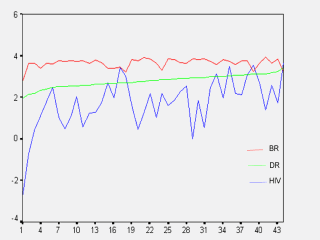
won’t go with the death rates or their increases. See the graphic.
The variables of this graph are log transformed. Death rates (DR, green line) are sequenced from very low Mauritius to high Botswana. BR red is birth rate. HIV blue is prevalence. The prevalence data (HIV) demonstrates unreasonable irregularites. The rough proportion is that prevalance sometimes is 2/3 of the death rates (DR). Number 8 / The Gambia, 11/ Mauritania, 20/ Guinea, 29/ Somali and 41/Niger could be badly underreported.
|