| front |1 |2 |3 |4 |5 |6 |7 |8 |9 |10 |11 |12 |13 |14 |15 |16 |17 |18 |19 |20 |21 |review |
 |
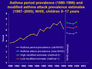
This chart shows
the impact of inflating the estimates from the redesigned NHIS for the
impact of the change in question format. Shown in yellow is the asthma
period prevalence from the standard NHIS from 1980 to 1996. Shown in blue is
the asthma attack prevalence from the redesigned NHIS from 1997 to 2000. In
green is the high modified estimate - inflating the asthma attack prevalence
by 34% using method 2 (overall estimate using study group 2 results), and in
orange the low modified estimate - inflating asthma attack prevalence by 19%
using method 1 (overall estimate using study group 1 results).
Using either method 1 or 2, it appears that asthma prevalence has not substantially changed since the mid 1990s. Which method is better? Each has its advantages. Method 1 uses study group 1 that has a larger sample size and more stable estimates. On the other hand method 2 uses study group 2, the sample that received both the 1988 NHIS standard survey and 1988 CHS questions and made possible the direct comparison between a given sample's responses. Neither will tell the "truth" about actual asthma prevalence estimates, but can give some idea about the general trend of asthma in the years 1997-2000. Fortunately, another question was added to the NHIS in 2001 that add some completion to the asthma prevalence estimates available. Prevalence estimates for this additional question are shown on the next slide. |