| front |1 |2 |3 |4 |5 |6 |7 |8 |9 |10 |11 |12 |13 |14 |15 |16 |17 |review |
 |
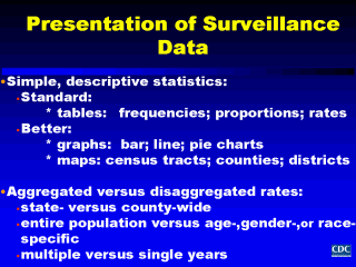
In general, when summarizing surveillance data, simple descriptive statistics are often all that is needed. In the past, counts or frequencies, proportions, and rates were typically presented in tables. Now using graphic computer software, we can present surveillance data summaries as bar or line graphs, pie charts, and maps. Such presentations allow us to look at data both aggregated and disaggregated across different segments of the population, different geographic areas, and multiple time periods. It’s important to remember that tabular presentations of surveillance should have titles indicated for the tables and the rows and columns labeled; for graphs, titles should also be provided as well as axes and legends labeled. This will allow the reader to clearly understand what is presented and how best to use the information. |