 |
Whenever
information you want to discuss is complicated or detailed in nature, summaries of it
should be provided as handouts so that your audience can look at it during your are
presentation as well as take it with them to think about at a later point in time. And as
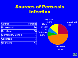
we discussed earlier, graphic displays of information are preferred over tabular ones. For
example, of the two presentations of data concerning the sources of infection among cases
of pertussis presented here, the pie chart is much more effective than the table in
readily conveying that the majority of pertussis cases have an unknown source of
infection. In addition, the pie chart is much better at grabbing the attention of the
reader, and lends itself to being abstracted by people such as local public health
practitioners to share with members of the public, and news reporters when writing
stories. Such efforts themselves further promote the communication of surveillance
information with other groups. |
