| front |1 |2 |3 |4 |5 |6 |7 |8 |9 |10 |11 |12 |13 |14 |15 |16 |17 |18 |19 |20 |21 |22 |23 |24 |25 |26 |27 |28 |29 |review |
 |
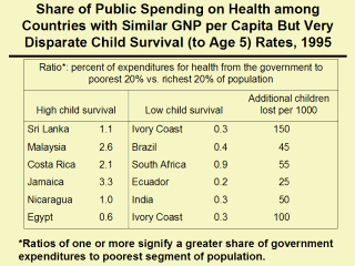
In this
chart, countries on the left are paired with countries on the right that
spend a much lower proportion of government expenditures on health for the
poor than for the rich. Each pair has approximately the same gross domestic
product (GDP) per capita. The number of children per 1000 who survive to age
5 is much greater in the countries on the left; countries that provide a
greater percentage of resources to the poor compared with the rich have
between 25 and 150 more children who survive than their paired country.
Sources: analyses from data in: Karolinska Institute. Global health chart, www.whc.ki.se/index.php, accessed September 29, 2004. Victora CG, Wagstaff A, Schellenberg JA, Gwatkin D, Claeson M, Habicht JP. Applying an equity lens to child health and mortality: more of the same is not enough. Lancet 2003; 362(9379):233-241. Castro-Leal F, Dayton J, Demery L, Mehra K. Public spending on health care in Africa: do the poor benefit? Bull World Health Organ 2000; 78(1):66-74. Carr D. Improving the Health of the World's Poorest People. Health Bulletin #1. Washington, DC: Population Health Bureau, 2004. |