| front |1 |2 |3 |4 |5 |6 |7 |8 |9 |10 |11 |12 |13 |14 |15 |16 |17 |18 |19 |20 |21 |22 |23 |24 |25 |review |
 |
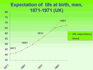
So, by re-visiting this
graph, we can see that the deviation from the projected line which begins around 1941 may
be interpreted as reflecting several things. First, by this time, few children were dying so there was little gain in the average years of life expectancy. Second, the higher mortality among young males during WWII would have pulled this average down. If this were a significant contributor, we will expect to see the line of life expectancy begin to increase its slope again after 10 or 20 more years. Third, at around the time of WWII, new medical technologies,spurred on by the war were beginning to emerge. In the 1950s these may have begun to slow down the improvements in years of life expectancy. Changes in society (inactivity, under-nutrition followed by over-nutrition) may have begun to have a negative impact on average years of life expectancy. Another change may have been shrinking family sizes and fewer children available to die in childhood up to the war years, followed by the baby boom in the optimistic post-war period may have increased numbers of vulnerable children. Can you think of other interpretations or explanations for the chart pattern? |